Context
Brazil is the country that has the highest number of depressed people in Latin America. According to the World Health Organization (WHO), 5.8% of the population suffers from this condition. In 2020, the COVID-19 pandemic brought about more situations that triggered the disorder: fear of contagion, loss of family members, financial crisis, and social isolation are examples of the aggravating factors in the new scenario we are experiencing.
Challenge
Motivated by the impact that the COVID-19 pandemic had on the mental health of Brazilians, during the course promoted by Leandro Rezende, mentor at UX Unicórnio, the team composed of Fernanda Albuquerque, Gabriel Moretti and Luana Menezes started the first UX Design project, accepting the challenge:
How can we take advantage of telemedicine opportunities to encourage people to consult psychologists and psychiatrists to take care of their mental health and help overcome the traumas of the pandemic?
Objectives and metrics
Based on the results of our research, it was possible to define some specific objectives that we believe are key points in achieving the general objective, they are:
Obj 1: Make remote consultations more financially accessible
- KR 1.1: The team must carry out quantitative research with at least 60 people
- KR 1.2: Each member must do qualitative research with at least 3 people
- KR 1.3: The team must perform benchmarking to analyze the prices of existing services
- KR 1.4: The team must present service proposals that are at least 25% cheaper than the market
Obj 2: Make the professional registration process less bureaucratic
- KR 2.1: Each team member must interview a professional and understand the need
- KR 2.1: The team must present proposals for simplified registrations with a maximum of 3 steps
- KR 2.1: The team must create prototypes and validate through tests with 5 to 8 users
Obj 3: Enable friends to recommend psychologists among themselves
- KR 3.1: The team must evaluate the research and verify the possible effectiveness of the functionality
- KR 3.2: The team must prototype and validate the usability of the functionality with the user
- KR 3.3: The team must include the presentation of the functionality in the onboarding
Benchmarking
It was possible to see that for the points raised, no platform covers everyone. A survey was also carried out on Reclame Aqui and in comments in app stores to find out the positive and negative opinions of users.
User Profile
The solution will be aimed at people who need psychological support, both for people who started to need it due to the pandemic, and for people who received it in person and had to adapt to online consultation. It is also aimed at professionals in the mental health field, so that they have visibility in the virtual environment of telemedicine.
Personas
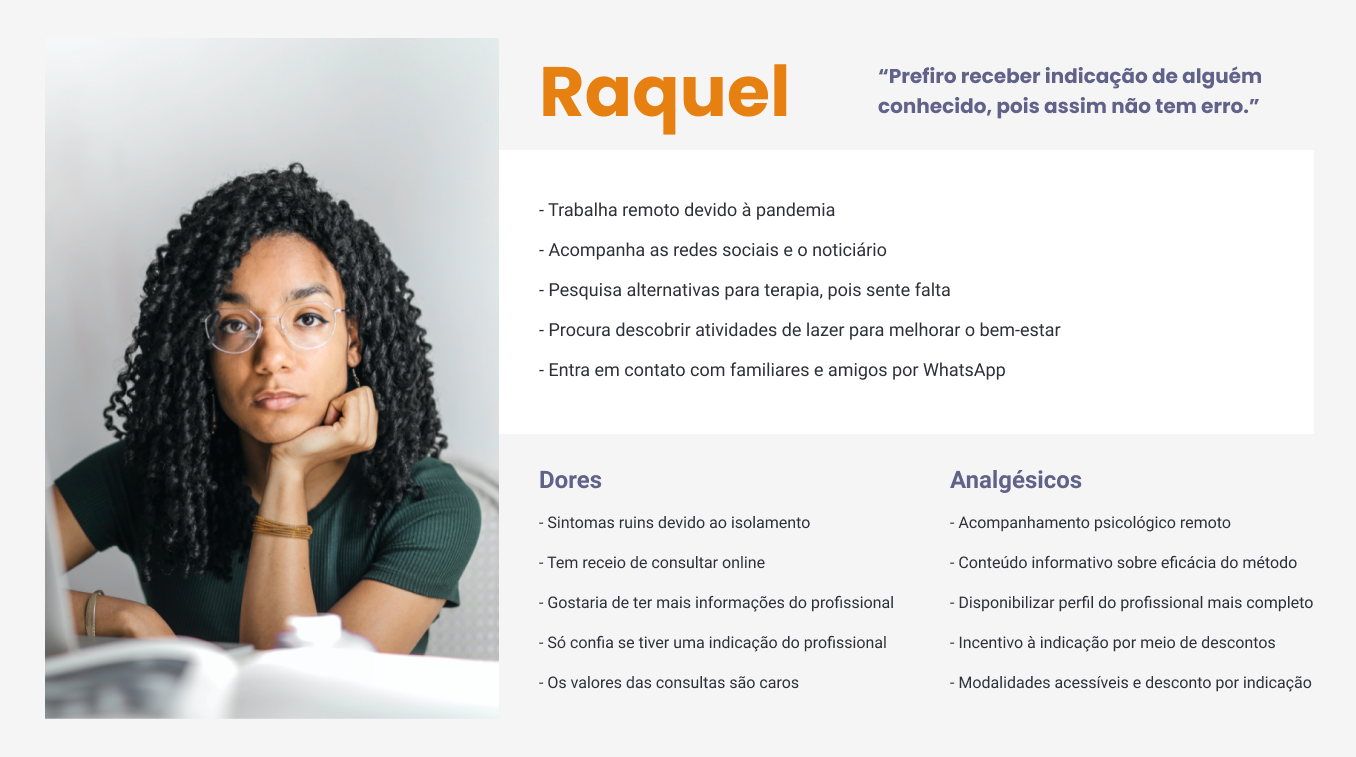
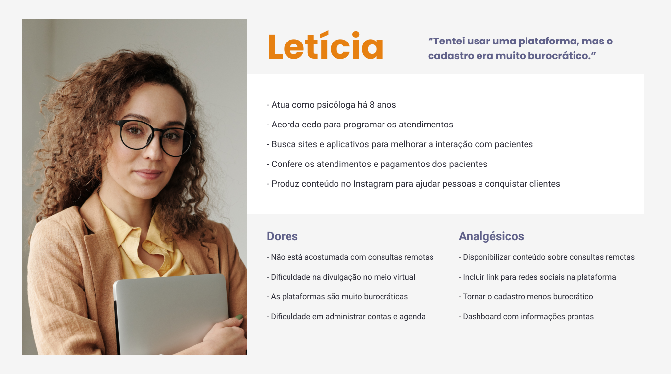
Two personas were created to better understand the context in which the product will be applied. The information contained in the personas below was validated through research.
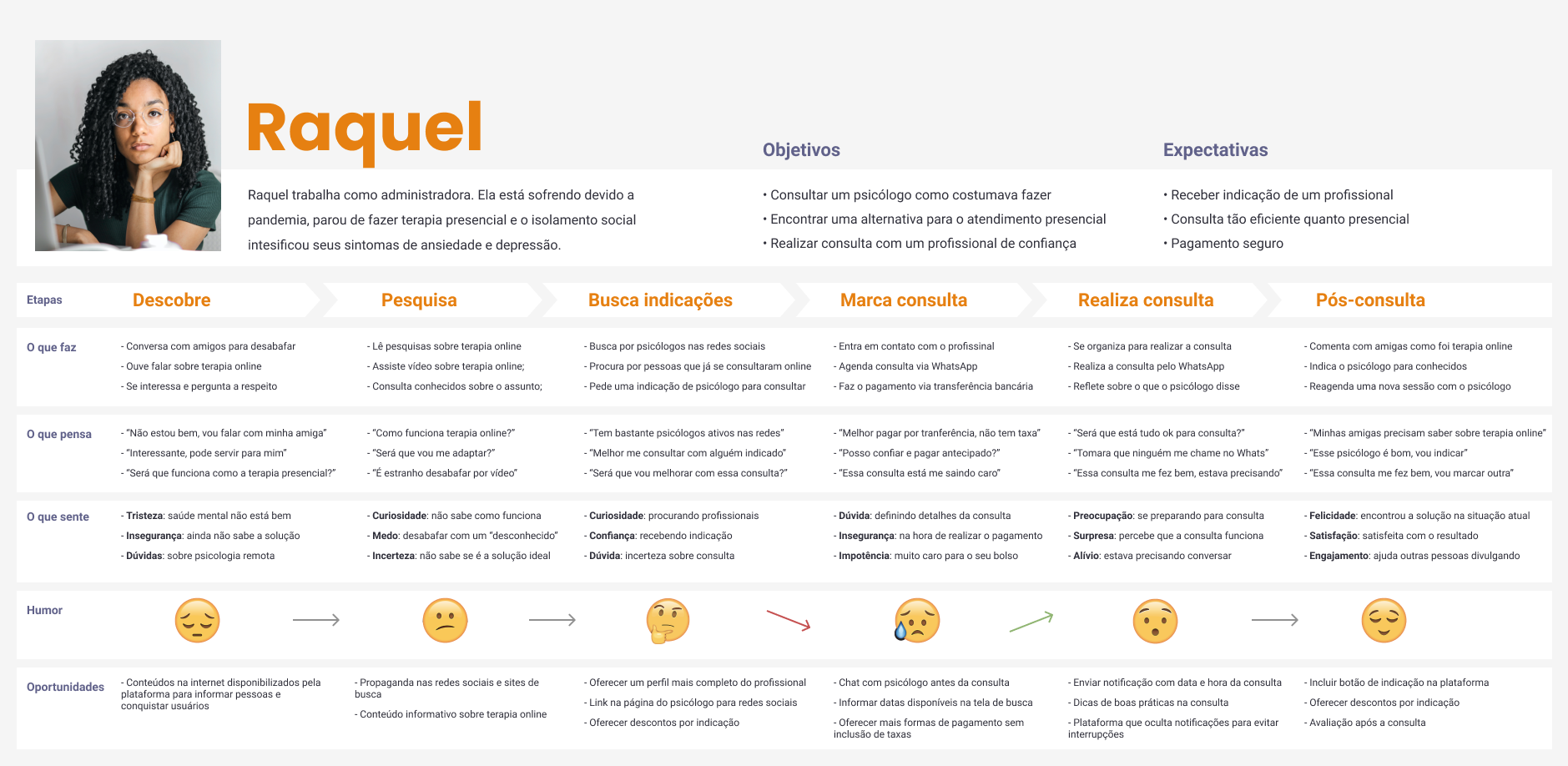
Raquel represents people who were undergoing in-person therapy, but due to the pandemic they can no longer go to the office and are looking for an alternative.
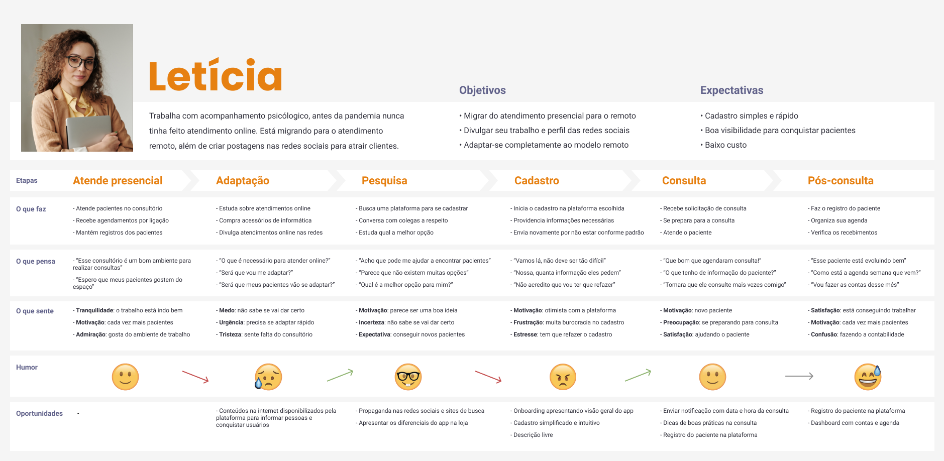
Letícia represents healthcare professionals who are adapting to the remote care model, looking for tools and platforms.
User Journey
We create each user’s journey map based on the Nielsen Norman Group model, to identify the thoughts, attitudes and feelings expressed at each stage. With this information we were able to analyze where we could improve the experience of each user using our solution.
Quantitative Research
To validate the information and better understand people’s pain, quantitative research was carried out. To defined what would be asked in the research, we completed the CSD Matrix. Then we take the assumptions and doubts to the Impact x Knowledge Matrix where the assumptions and doubts with more impact and less knowledge are prioritized to validate in the research.
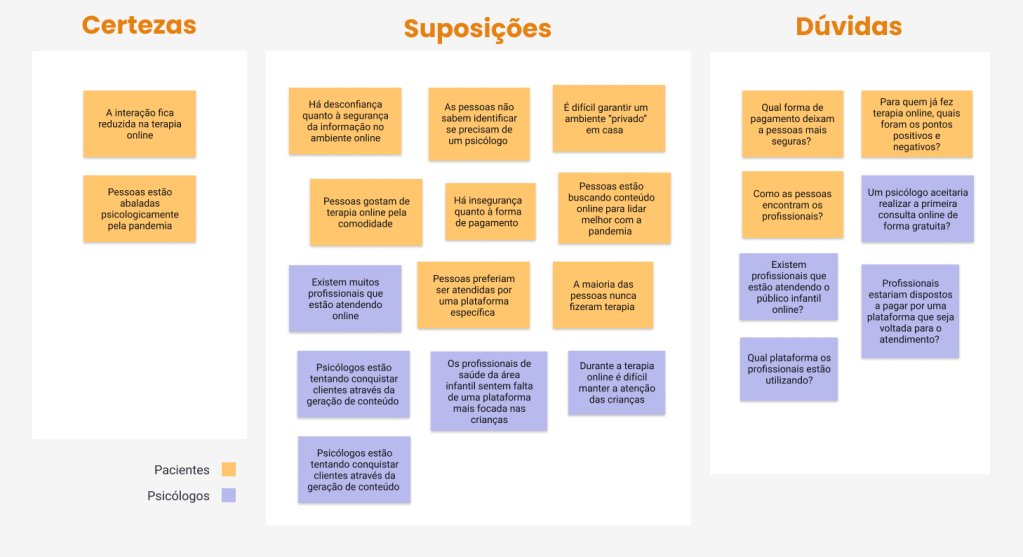
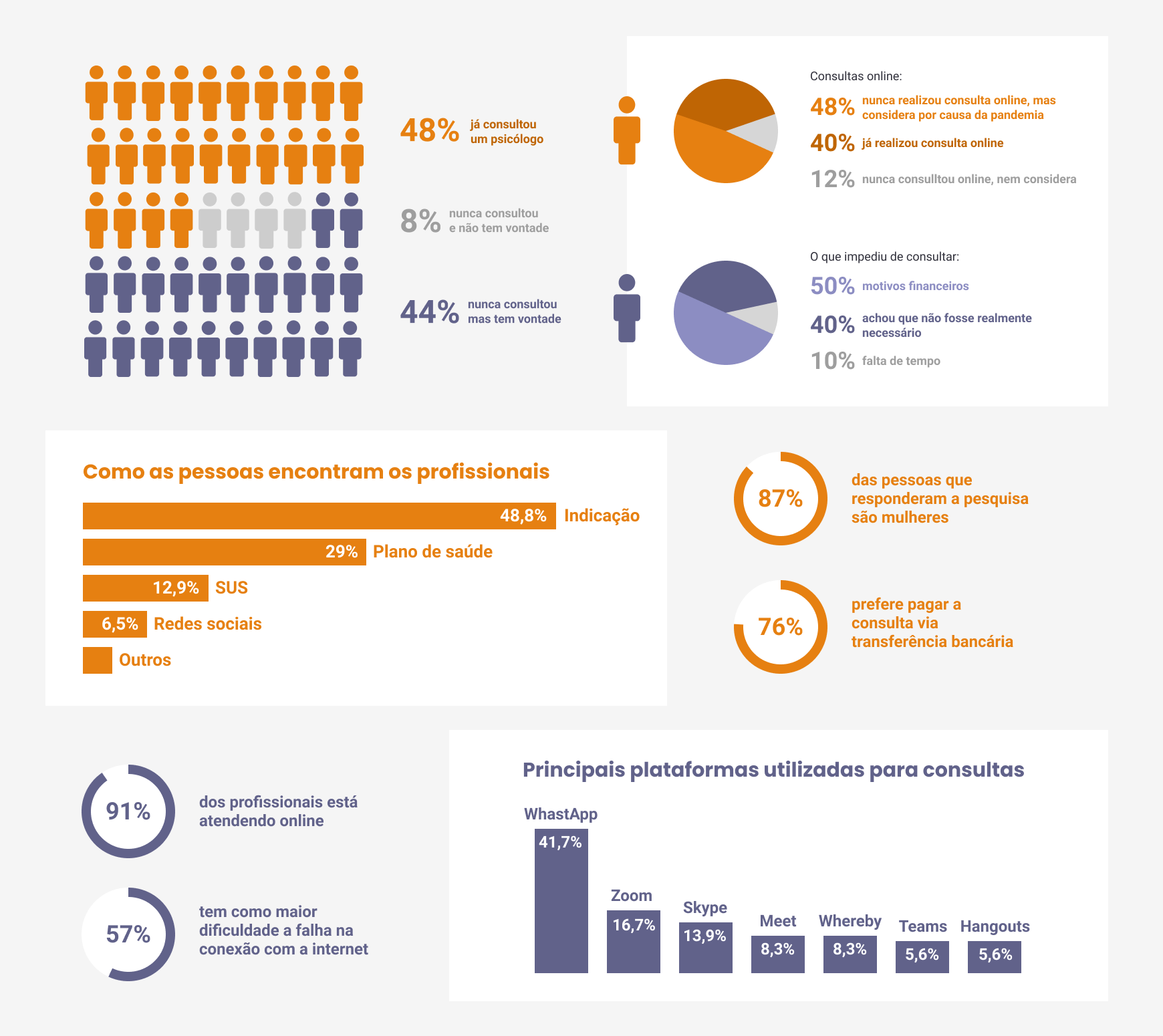
Results
After sending the forms to the target audience, a sample of 117 people was obtained. The responses found validated some assumptions of the journey and invalidated others. We highlight below some interesting data obtained in the survey:
Qualitative Research
When analyzing the data obtained in the surveys, we identified some interesting facts that we addressed in the qualitative research.
The type of our research was semi-structured, conducted remotely via WhatsApp with three patients and three professionals. The intention was to understand the reasons behind the responses obtained in the quantitative research, delve into some interesting points, and gain new insights about the user’s context.
The objectives of the interviews and the responses were:
- Understanding the choice of payment via bank transfer.
- How people find professionals.
- What do people want to know about professionals before the consultation?
- Why do none of the interviewed professionals use a specific platform for remote psychological sessions?
- In addition to the content on social media, what are professionals doing to attract new patients?
Solution Alternatives
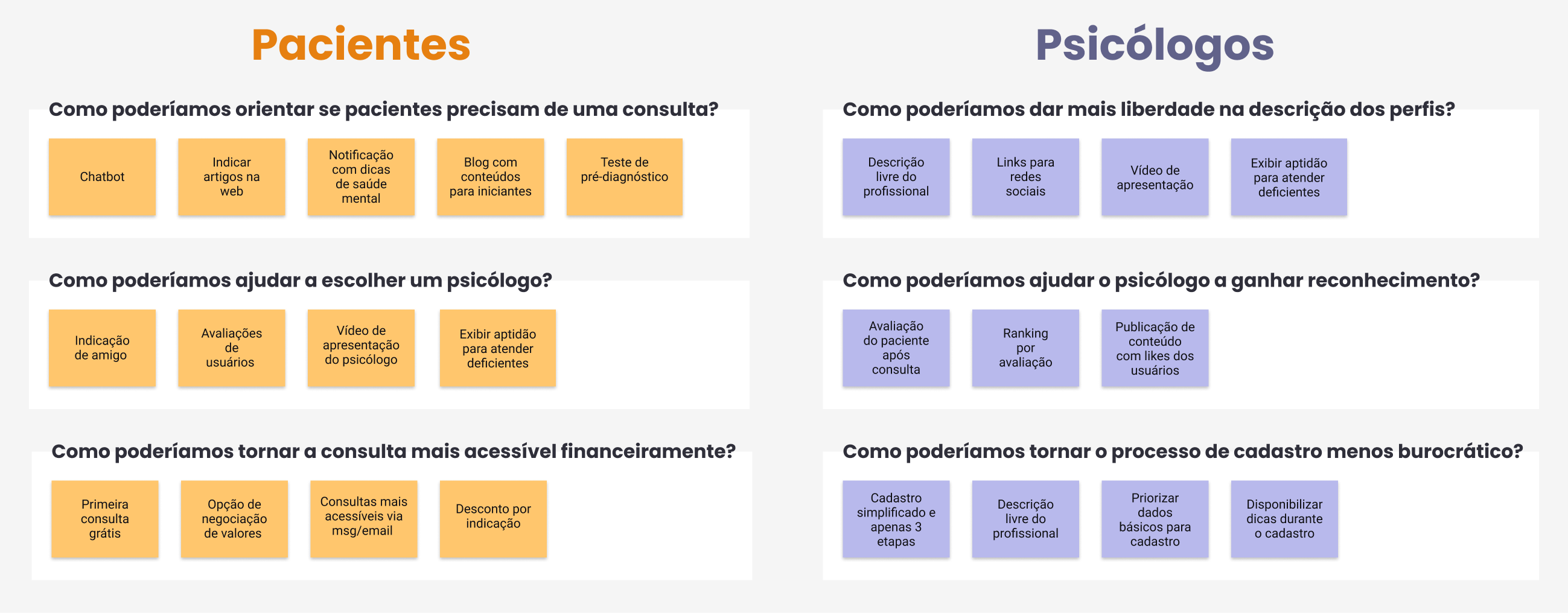
After analyzing the results of the surveys, a brainstorming session was conducted using the How might we? H.M.W. technique to come up with a solution for each identified problem.
Prioritization
After several brainstorming features emerged, they were inserted into the Impact x Effort Matrix to visualize what would be prioritized and what would be discarded.
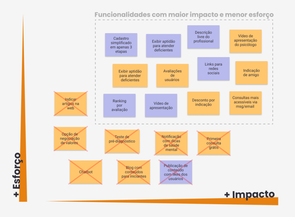
With this activity, it was possible to realize that all solutions aimed at people who have never consulted had a high effort to be developed. These solutions would be intended for only 44% of our patient audience, while solutions for financial issues would benefit 100% of the patient audience. Keeping this in mind, it was decided to prioritize solutions to the financial problem and leave solutions for people who have never consulted for a future release.
Brand
The word asana refers to contemplation (meditation) in a seated position for long periods. Today it is considered a psychophysical yoga position. In the Yoga Sutras it is described as sitting in a firm, comfortable position for meditation, where contemplation is the path to understanding.
Prototyping & Testing
After defining the solutions, we move on to the ideation phase. In order to validate the sketched ideas, we create a flow to be tested with real users.
Flow for psychologist user to register
Flow of the patient user person to book the appointment
To perform the validation of the low-fidelity prototype, we interviewed 3 psychologists and 6 patients via video call. The objective was to analyze the usability of the designed interface and identify areas for improvement to create the wireframe.
Feedbacks
Through user testing, we were able to identify areas for improvement based on user observations and comments. We noted the following feedbacks:
Patient user profile
- It was confusing to access the psychologist’s profile because there was no specific button
- There was no filter for the appointment date; the search results were limited to the profile only
- The user questioned whether there were other payment methods available
- The login screen only appeared when scheduling the appointment, which was confusing
Psychologist user profile
- Accessibility is a very important point
- Information about academic background could be included in the first stage of registration
- The hamburger menu may go unnoticed
- Simplify the process of sending discount coupons
- The send button is missing in the chat with patients
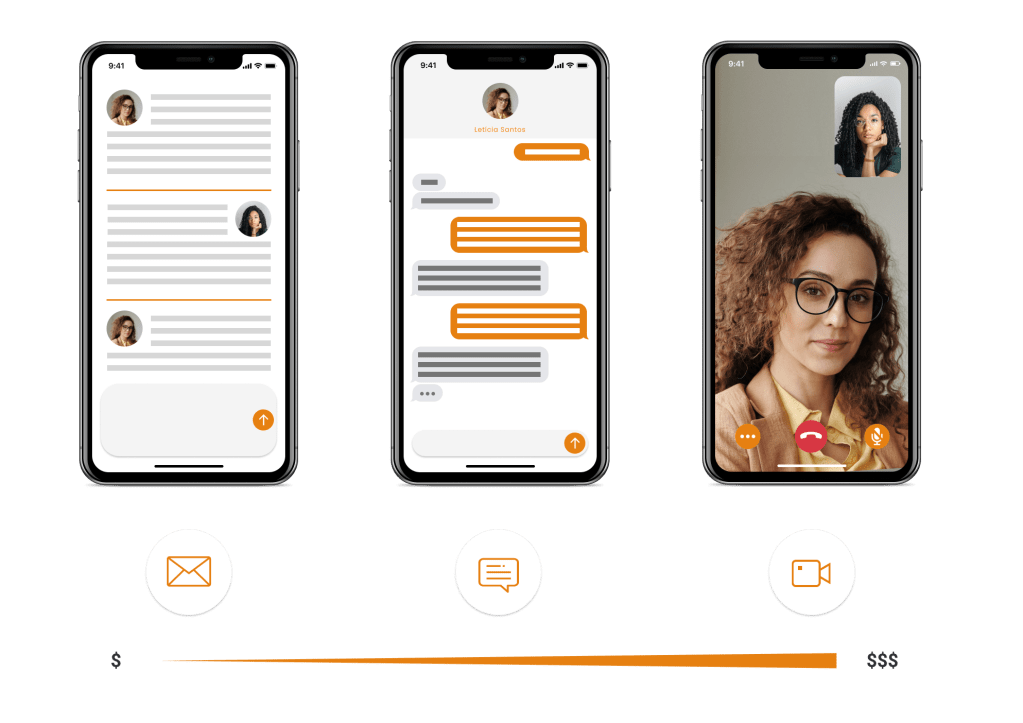
Consultation Modes
The solution that has been prioritized to make consultations more affordable is to provide consultations in email and chat format. Inspired by existing platforms in the market, this format allows psychologists to conduct consultations with less effort and resources, reducing the cost of the consultation. The three consultation modes are represented below.
Style Guide
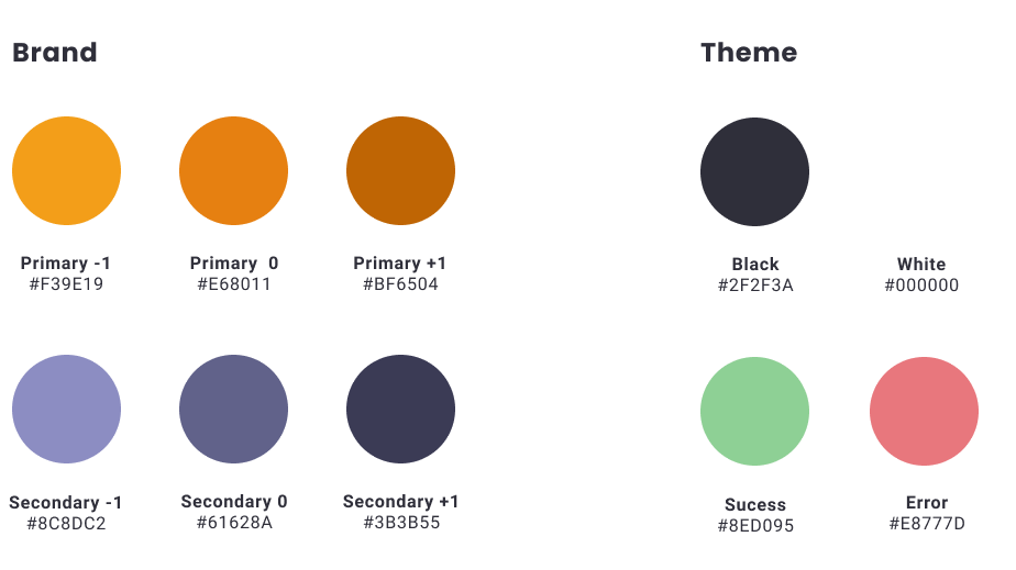
After the wireframe is ready and the first usability test is done, let’s define the visual identity of the Asana application. Based on the benchmarking study, we created the style guide to ensure consistency, scalability, and flexibility, making management and handoff easier.
Colors: The main color used is orange as it stimulates the brain to see with more joy and vitality. It is also associated with sensitivity, intuition, and self-awareness, according to chromotherapy teacher Maristela Munhoz. Blue is mainly associated with a sense of peace, similar to white but in a more subtle way. It evokes cleanliness, water, serenity, and productivity. In darker shades, it conveys security, trust, success, and power.
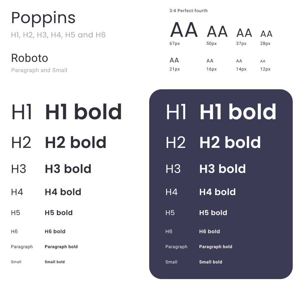
Typography: The chosen typography for titles is Poppins, as it conveys lightness through its minimalist design. For paragraphs, we used Roboto, which has a more fluid reading experience. Choosing a sans-serif font is important to allow character resizing without distortion or illegibility. The perfect fourth proportion was used to achieve balance and sobriety between the texts.
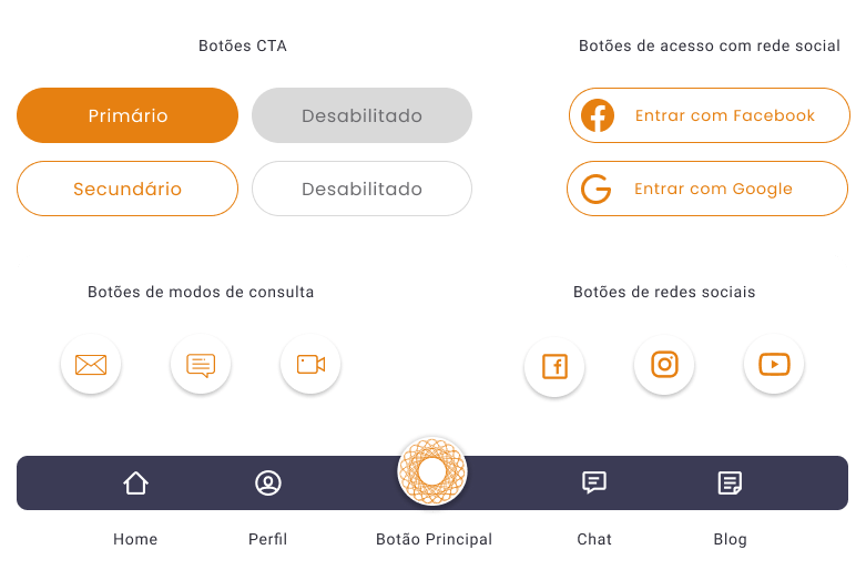
Buttons: to provide hierarchy among the buttons, a primary button was created with a solid orange fill, and a secondary button in ghost style. The buttons have rounded edges to convey lightness and modernity. Round buttons were used for social network query and upload modes. The navigation bar has 5 buttons, where the central one is the main button that features the brand logo.
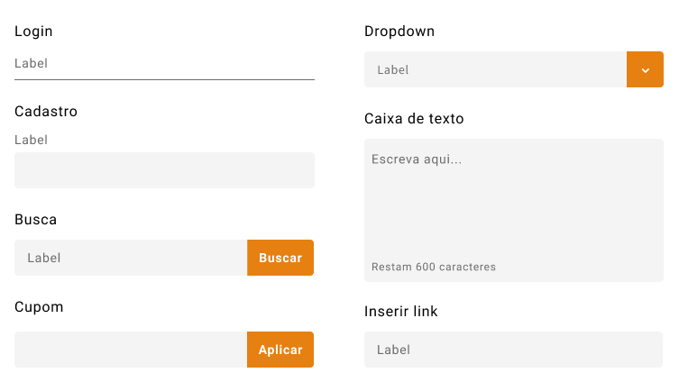
Forms: have been designed in the simplest way possible so that the user can focus on the information to be entered. Whenever possible, an example of the data to be entered in the field is presented, represented by “label”.
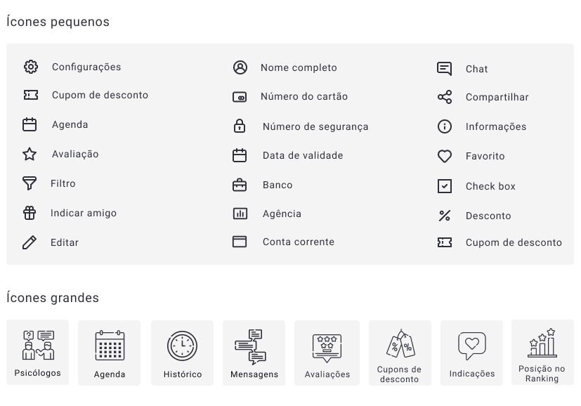
Icons: used to provide a quicker understanding for the user by associating the image of the icon with the written name. Minimalistic icons were chosen to facilitate identification and match the brand. On the home page, some buttons in the carousel format appear with larger icons. The idea is for the user to become familiar with the symbol and no longer need to read the button, making navigation smoother.
Conclusion and learnings
Working on this project provided a close look at every detail of the UX Design process while also allowing for a broader perspective. Gathering information from users through research and interviews proved to be crucial in understanding the real problem to be solved. Many ideas surfaced, and an important part of the process was defining what would and would not be done. Prototyping and validation should occur frequently during product development to validate the idea as soon as possible and avoid wasting a lot of time.
I would like to thank Fernanda Albuquerque and Luana Menezes for the successful partnership. Also, thanks to Leandro Rezende for the countless hours of quality content, and mentors Rafael Frota and João Traini for clarifying doubts and providing improvement tips.
